How to Make your Website Rock with Stunning Portraits

Often, I get asked for what kind of pictures are needed to make a good website. I want to share with you some suggestions that won’t make your website just look good–these suggestions will help make your website rock!
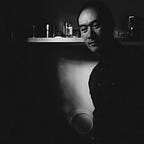
Bokeh
First suggestion, when you hire a portrait photographer, I would definitely let them know you need some bokeh portraits. If your photographer doesn’t what the heck bokeh means, you might need to find someone who does. Bokeh often refers to a technique where the background is out of focus (blurry) but the person is in focus. This style naturally makes the person who is in focus stand-out or pop! Contemporary smart phones and photo apps can generate a bokeh effect, but it doesn’t look natural (it looks pretty fake). And, we don’t want fake images for our great website. Learn more about bokeh here.

Negative Space (Copy Space)
As an artist and website designer, I love negative space. Digital marketeers affectionately call this copy space. And, copy space actually sells. How do I know this? The photos I’ve personally sold had loads of negative space and were tagged with, you guessed it, ‘copy space’. There are two main reasons why these types of images are important 1) the space gives the digital marketer and website designer a place to put text (aka copy) and 2) negative space naturally frames the subject of the photo. So, the eye is drawn to the subject making the subject pop! There goes that annoying buzzword again. Anyone counting?

Horizontal, Vertical, Wide Angle, Close-up
I usually can’t stress this one enough. Make sure you get the angles that flatter you and not the other way around. Your photographer should work the session with several angles. For the website’s key hero image and supporting images I look for these things:
- Hero: One to two bold wide-angle (10–22 mm lens) landscape (horizontal) orientation portraits for hero images. Make sure you are placed on the left or right third of the image to allow for ample copy space. I recommend your backgrounds are on the darker side and not busy (i.e., not distracting and so that white text can show up). These hero images will be used in the top banners for your website, social media profiles, and email campaigns.
- Wide landscape: Two to three wide-angle horizontal portraits where you can be in the middle. These should be full-body and capture your surroundings. These are great supporting images.
- Close-up landscape: Two to three standard angle (35–55 mm lens) horizontal close-ups of you from the waist-up and shoulder-up. These are excellent supporting images.
- Full-body portrait: Two to three standard angle vertical photos where your full body can take up the entire photo if wanted. Try to go for modest copy space or margins around you. Extra space can be cropped-out before posting to the site. These are great for bio sections with people that don’t want to show too much face or want to highlight their physique.
- Close-up portrait: Two to three standard angle vertical photos of you from the waist-up and shoulder-up. These are perfect for bio sections.
- Details: One or two standard angle vertical photos of items that help define you. These are more artsy close-ups of things like your bookshelf, guitar, laptop with cool stickers, or something you made.
- Lifestyle: Here, there are basically no rules. Ok, there’s one rule–you should be totally enjoying life when you are being photographed doing things you love to do. Maybe it’s riding your bicycle, jogging, sipping on a cappuccino, playing your guitar, painting, writing, reading a book, talking with friends, getting dirty in the garden, cooking, or spending quality time with your family and pets. Pretend that there is no camera around to increase your authenticity factor.


Be Authentic
Like most photographers, I’ve been asked to manipulate (ahem, “modify”) photographs to the point where the picture doesn’t look real. Why do I fulfill the request? I do what I’m asked so I can show a physical result. Then, I can confirm with them if this is what they really want. I mean, what kind of message are we sending with an over-edited or even fake photo? This reality check has worked every time. Authenticity is queen/king.
Is there a fine line between editing and over-editing? I think so. I make photos using raw files. Meaning, my camera is set to record as much as technically possible the most information about an image. Raw images don’t look nice right out of the camera. Raw files need post processing. Editing is matter of preference and style. In general, I fine tune exposure, contrast, white balance, leveling, and colour tone. I will remove or crop small items I find distracting and unflattering to the entire composition (not just to the subject). Do I remove every scratch, paint chip, wrinkle, or blemish? No. I want to keep a balance of art, aesthetics, and reality.